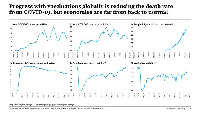
The state and story of the world economy in one slide

While I’m a complete amateur when it comes to “big data”, I am pretty pleased with myself for having learned Python (and a little bit of Pandas) last Christmas. I have also started using Alteryx to avoid waiting for hours for Excel to “calculate”, only to have it crash in the end. I’m sorry, Excel: I think our love story is coming to an end. [I still have the mug, though, saying “I love spreadsheets”. I’ll keep it as a memento of all these wonderful years together. Don’t worry — I’m not abandoning you— but for the big tasks, I’m afraid I will have to turn to others. And in all the years together, I rarely strayed to alternatives, such as Google Sheets.]
So, with my newly-found “power”, I have been able to automate the workflow of downloading daily data from Our World In Data (for everything COVID-19 related), the Blavatnik School of Government (for data on government responses), and Google (for their mobility indices), cleaning and merging it, and uploading it all into Tableau. I’ve also added in less-frequently-changing but still relevant quarterly GDP data by country (from the IMF) and consumer and business confidence indices (from OECD).
Lots of happy hours spent playing with the data have also produced some pragmatic output. I’ve figured out that Google’s “Retail and recreation” and “Pharmacy and grocery” mobility indices are decent (but not brilliant) proxies for what might be happening to more macro indicators, such as GDP. I think I have come to better understand the new dynamics at play — which may not be “new” to others, but are “new” to me in the sense that I can now finally see them in the data. [Something I tend to prefer to words or anecdotes.]
Therefore, I’m pleased to share this #dataisbeautiful chart, telling the story of the current state of the world economy on one page, through six panels. Here’s how it goes:
- Globally, in as much as we can trust the data, the delta variant seems to have slowed down its spread since mid-August
- And death rates in the most recent cycle of infections are signifncatly lower than previously
- This has been driven to a large degree by the rapidly progressing rate of vaccinations in many (but not all) parts of the world
- This has allowed governments to start removing restrictions and tapering down their economic support to people and businesses
- Net net, activity levels are now returning to levels before the pandemic, but with some hesitancy remaining (e.g., due to delta variant)
- But we are not returning to the “old normal” — a significant number of workers don’t seem to be returning to their workplace
Looking forward, the historical data would suggest that we may not see a straightforward victory over the virus; or a straightforward economic recovery. There are too many forces that are simultaneously pulling the economy in different directions. On the upside, vaccinations, “accidental savings”, returning consumer and business confidence, and robust global demand are all enabling the economy to come back to life. On the potential downside, vaccine hesitancy, labour market frictions, inequality, or tighter monetary and fiscal policy may all slow down the recovery trajectory.
In physics and complex systems (such as the economy), opposing forces like these— which sometimes counterbalance each other and sometimes do not — typically result in wide oscillations. So I will not be surprised if the economy, too, will continue its rollercoaster ride (albeit with diminishing amplitudes).
By the way, since I have all this data in Tableau, it takes a minute or less to cut it by country, country grouping (e.g., EU, OECD, income level), region, or other variables — so do send in any requests or questions (e.g., by responding to my Tweets or LinkedIn posts).

